AIM: Adobe X AMAZON DESIGN JAM
DESIGN JAM | FALL 2020
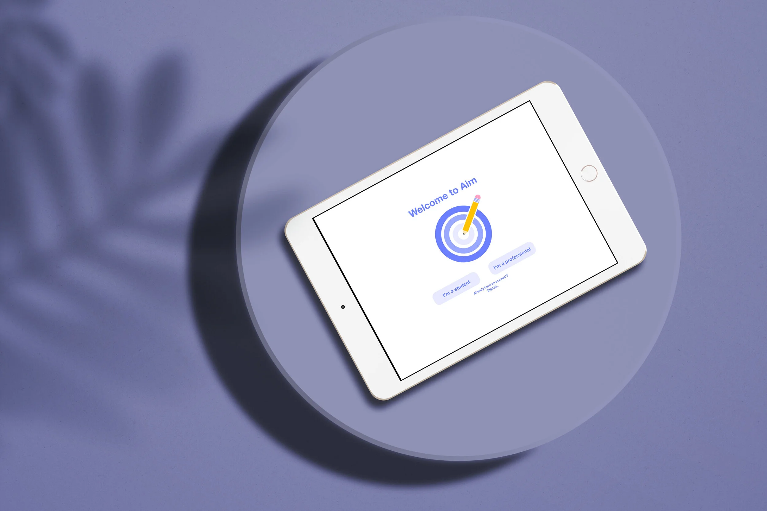
Aim: A tablet application to help high school students (age 13+) to #DiscoverDesign
Interface: Tablet
Duration: 1 week
Tools: Adobe xD
Aim is a tablet application that allows high school students to explore design in a low-stakes, safe, and community oriented environment. Because it can be extremely challenging for high school students to learn about design, and explore potential career paths, Aim was created to inspire and educate students. In a week-long Design Jam hosted by Adobe and Amazon, students were asked to “Design a tablet app to provide a safe way for high school students to #DiscoverDesign. Aim provides students with lessons on design, low-stakes design challenges, and the ability to connect with mentors and other students.
My role: Brainstorm, Research, Interaction Design, Product Design
THE PROBLEM:
Getting into the world of design can be intimidating and difficult. Young adults especially face many barriers in terms of learning design, including:
lack of course offerings
lack of knowledge of career paths
lack of access to mentors or those in the industry
This led to my initial question of: how might we allow young adults to discover design in an encouraging and approachable environment?
THE PROCESS:
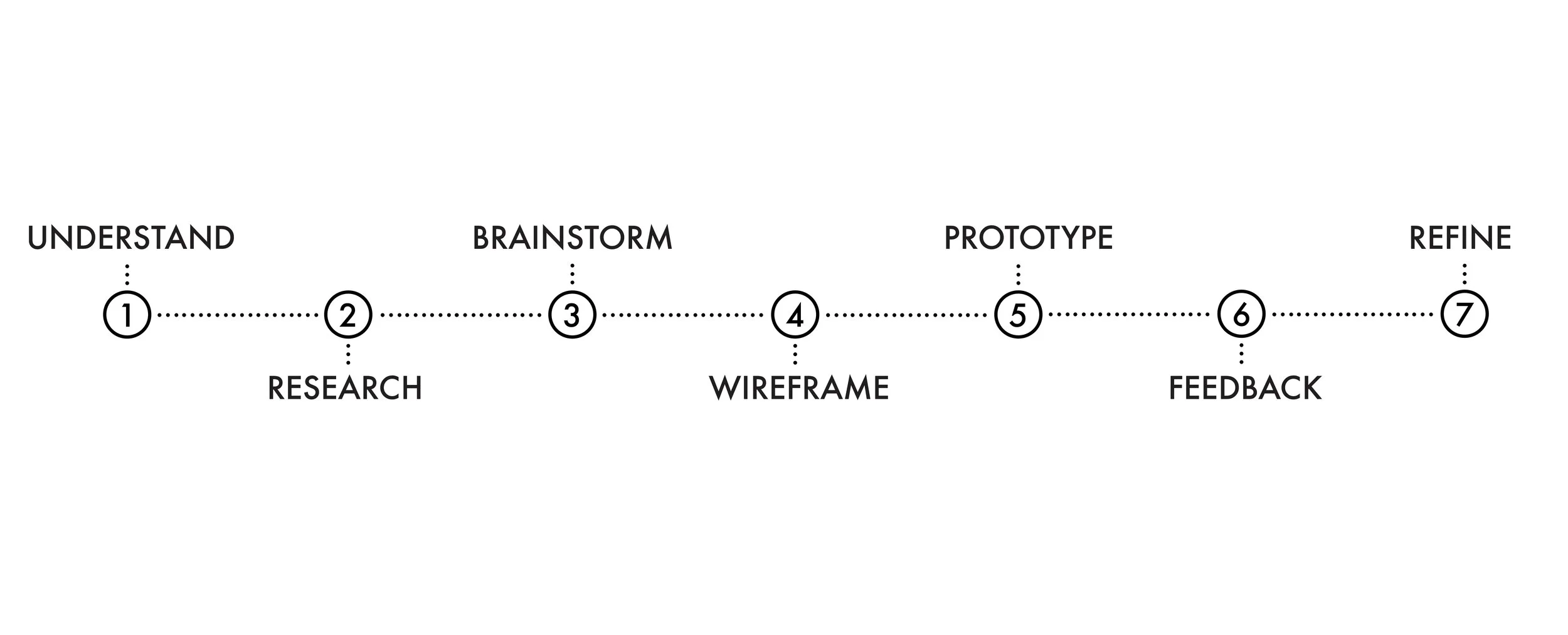
Understand:
For this project, we needed to understand the requirements in order to begin our ideation process. There were many paths we could take, and we needed to fully understand the prompt, the user requirements, and the timeline in order to best proceed. Eventually, we wrote down and kept in mind the following requirements, and the affordances that our application must provide to students:
discover what design is and how students interact with it everyday
help students see the impact of good or bad design
encourage students to explore jobs/careers in design
inspire students to start their own careers in design
get students excited about the design feel
interact with design in a safe environment
Research:
Given the short timeline, we decided upon the following research methods: user interviews and a competitive analysis.
Interviews
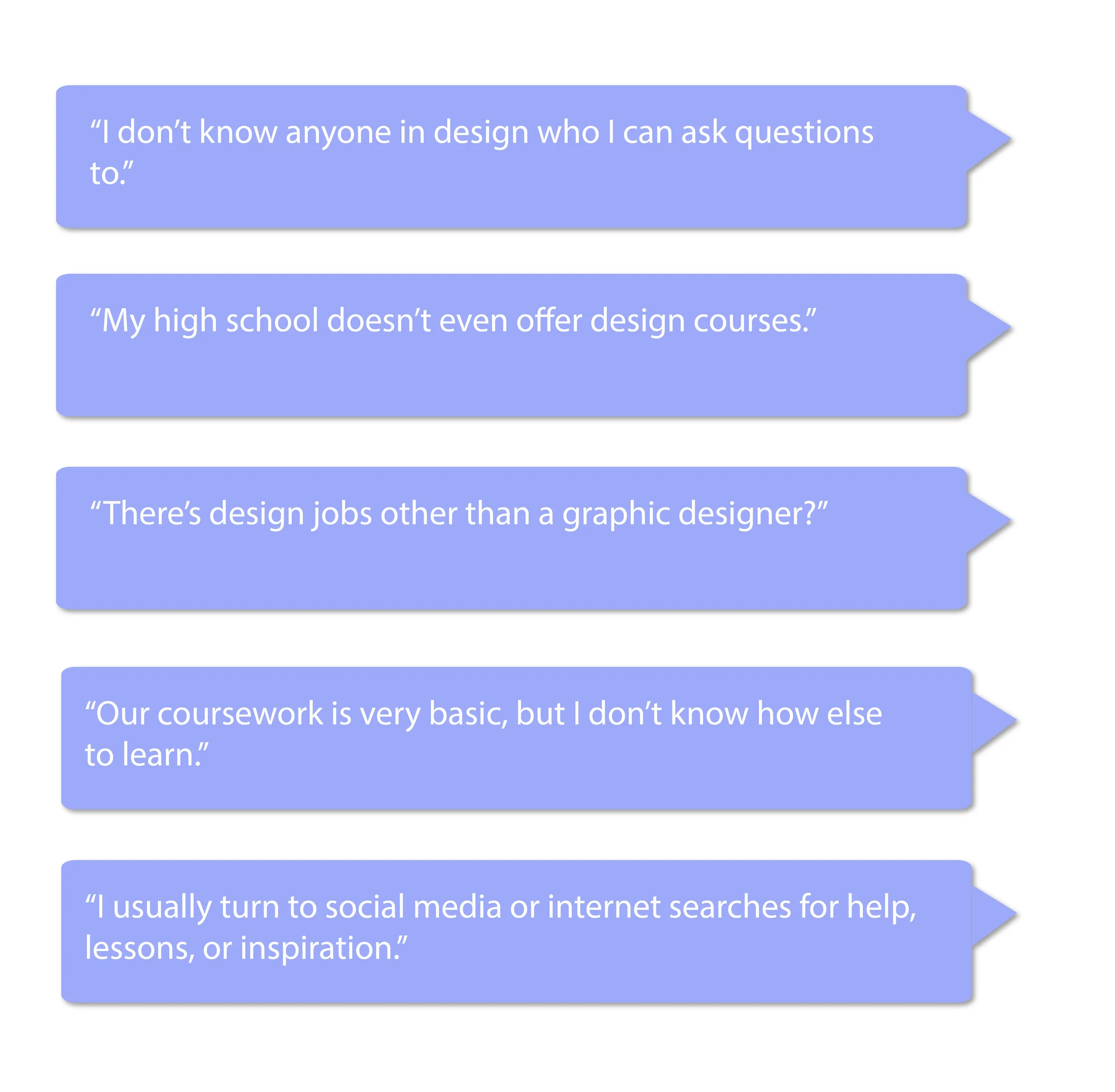
We conducted a total of 6 interviews, each with high school students interested in design. These interviews were conducted over the phone, and allowed us to gain insight into the minds of those for which we were designing.
Below are some of the questions asked, and impactful quotes we received during these sessions:
The interviews allowed us to empathize with the target audience, revealed key pain points, and inspired us to create an impactful solution.
Competitive analysis
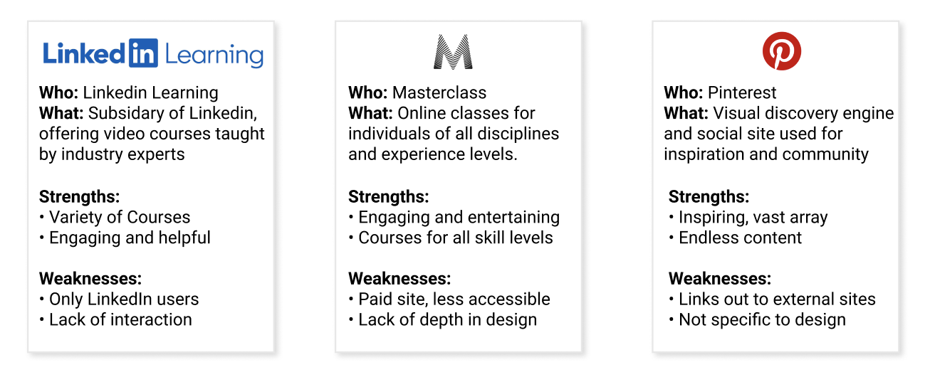
In order to better understand the problem space, I conducted a competitive analysis to understand other solutions with similar objectives. By understanding what they were doing well and what needed improvement, I was able to understand what our platform needed to include, and what was missing in the space that our solution could improve upon.
Our research helped us to better understand what we needed to include in terms of: accessibility, layout, identity, and navigation.
BRAINTSORM:
We began by focusing on the problem. Starting our brainstorm with the problem in mind, rather than making a solution and matching that to a problem, helped us to ensure that we were building a product with a specific market need. Using our research – and personal experience when first starting in the field of design – we began ideating around how to incorporate the following key components:
Allow students to connect with design mentors
Privacy protocols for young adults
Personalization features where users can fill out their interests
Design Challenges and lessons
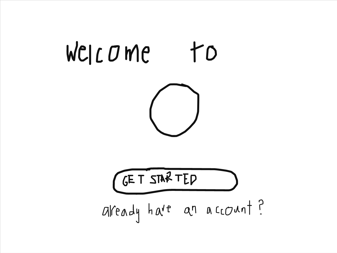
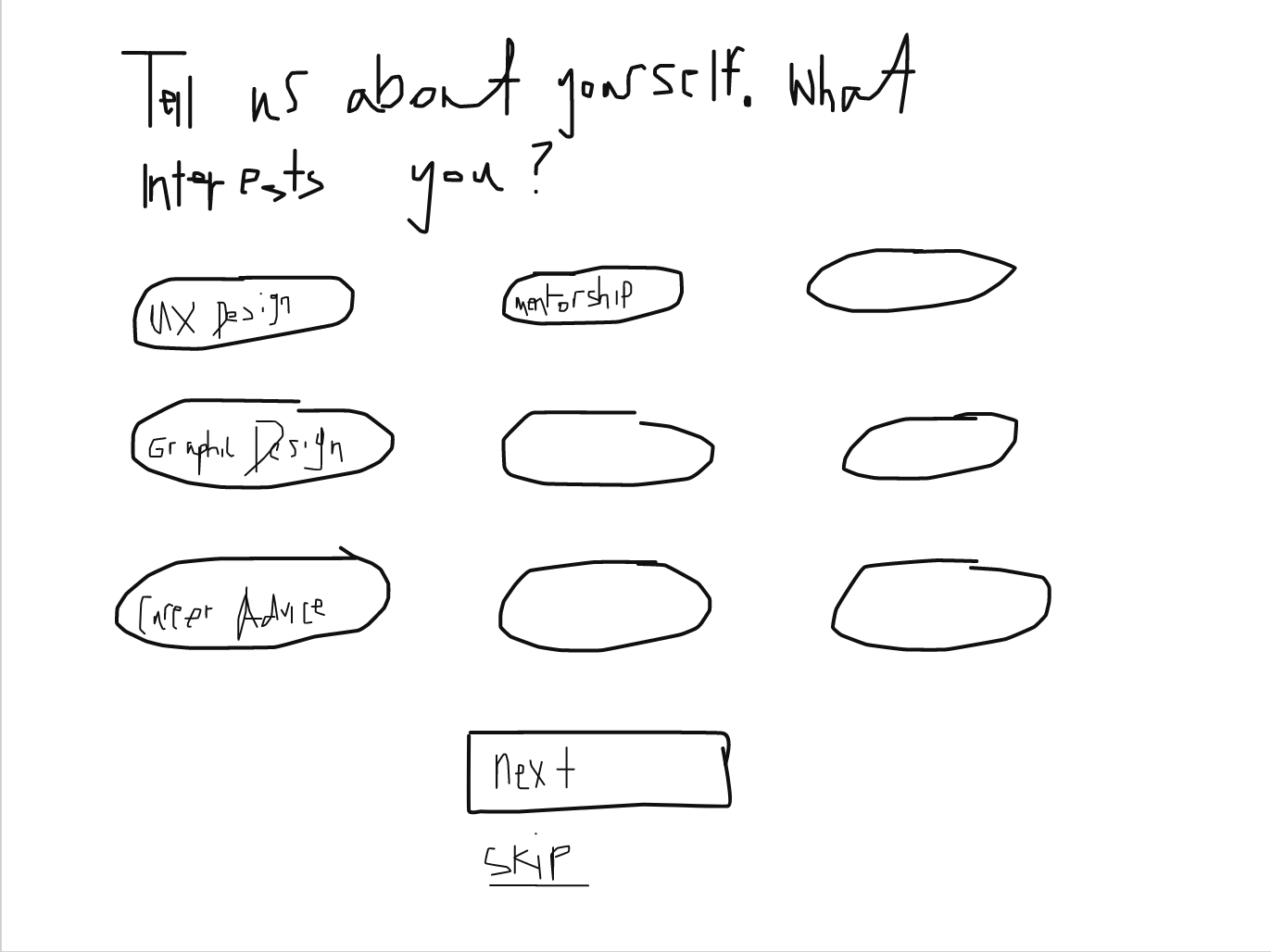
LOW FIDELITY SKETCHES
Our research and brainstorm inspired us to create an inspiring interface that would encourage students to explore and connect. Using the whiteboard plugin on Adobe XD to collaboratively whiteboard, we created low fidelity prototypes. This helped us to figure out how to implement the ideas from our brainstorm. Additionally, this helped us to understand what features would be necessary on the various pages of our product. Below are our initial prototypes:
Wireframe:
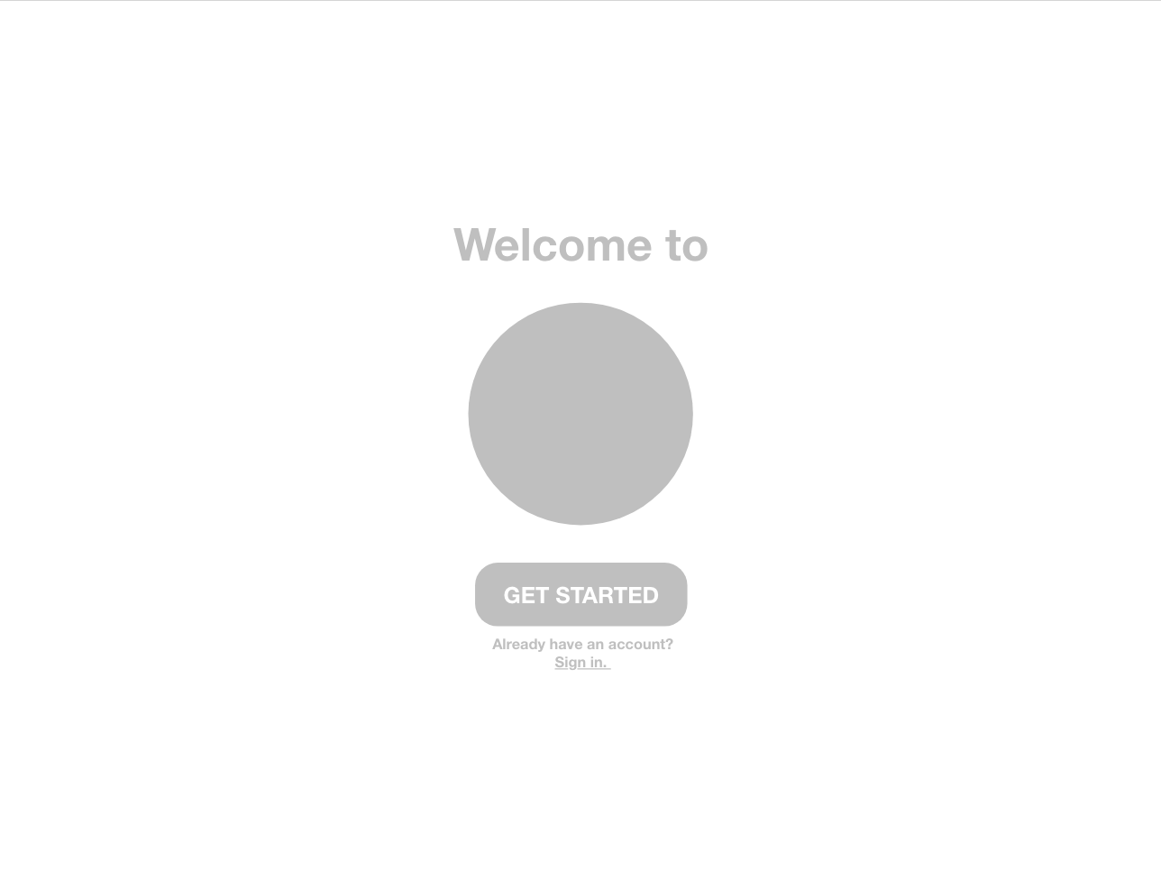
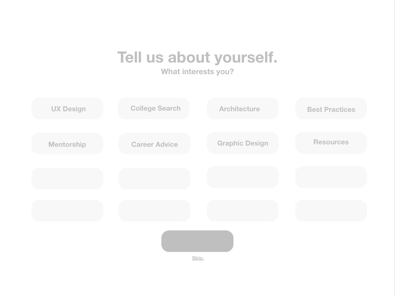
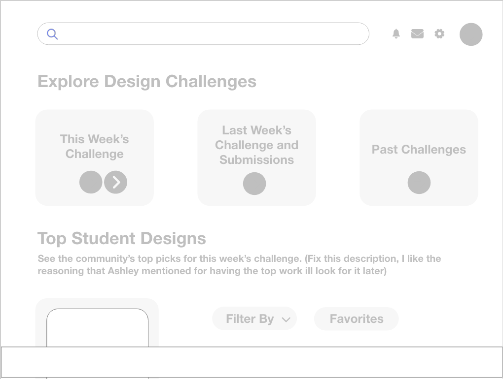
After understanding, researching, brainstorming, and whiteboarding, we were ready to wireframe.
Based on our sketches, we created low-fidelity wireframes. These wireframes were very basic, included no interactive elements, and helped us to better map out the shell of our interface. This step helped use to better understand the layout, UI elements, necessary screens, and start playing around with colors. During this process, we really began to see our idea come to life – and were able to start asking ourselves important questions about where we wanted to next take our solution.
PROTOTYPE:
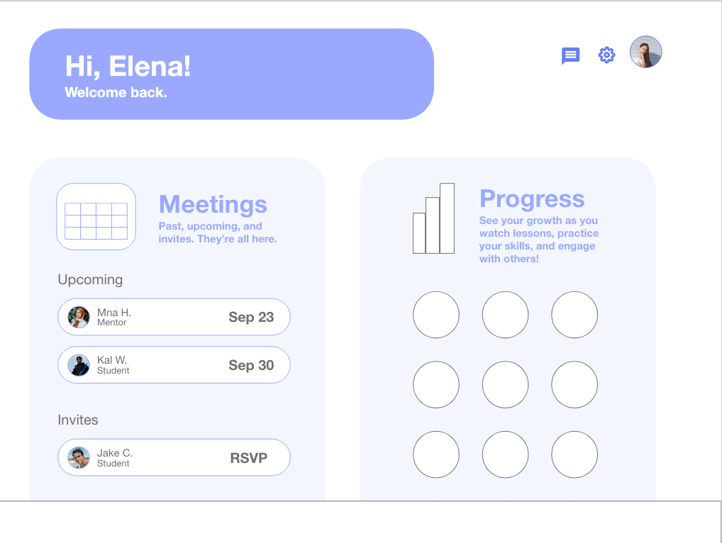
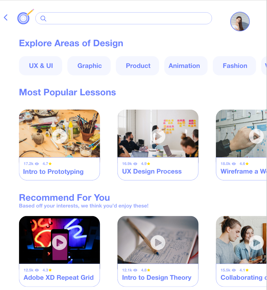
Wireframing really helped us to visualize our application, and prepared us to take it to the next step of development: prototyping. We were ready to add more structure, colors, design elements, icons, photos, copy, and – eventually – interactions.
REASONING
Using research and previous experience to inform our design decisions, below are some of the motivations behind our decisions:
FEEDBACK:
Two days before the deadline, we had the privilege to have a feedback session with a UX Designer from Amazon. During this session, we were able to show her our progress, get her initial feedback, and also ask her pressing questions we had.
Below are the main questions we asked her, and her direct feedback:
This feedback session allowed us to test our current prototype, gain feedback and insights from an experienced designer, and – ultimately – to move on to create a stronger iteration. The main decisions we made as a result from our feedback session were:
Removing students’ last names for privacy
Gave students the ability to make profile elements public or private
Refined our navigation, implementing a hamburger menu
Adding hover states to increase discoverability
Implementing pop up windows to display lessons
refine:
After our design advising session, we were ready to add the finishing touches to our project. We implemented hover states, micro-interactions, refined our navigation, card design, and privacy elements, and linked all of our pages together in an intuitive user flow. Additionally, we added features that allowed students and mentors to send emails, set up meetings, and view each others’ profiles.
NEXT STEPS & REFLECTION:
CONSTRAINTS
Time, 100% virtual setting, and lack of access to a larger set of interviewee’s were our main constraints.
NEXT STEPS
If we had more time, I would have wanted to perform usability tests on our interface. Gaining insights from our prototype and hearing users think allowed as they use AIM would allow us to take this design to the next level.
REFLECTION
The three main things I learned from this project were:
The value of research, even under a time crunch
Asking for and implementing feedback
The power of micro-interactions in interaction design
Our user interviews and competitive analysis provided us with unique insights we likely would have not otherwise realized. For example, we learned how much students prioritized being able to connect with mentors in different careers, and learned that many educational tools use yellow, blue and green as their color schemes. Gaining these insights early on allowed us to create a solution that was unique and impactful.
The feedback with the design mentor allowed us to gain crucial insights, as well as practice the iterative nature of design. Asking for, analyzing, and implementing feedback is key to a strong design. From this session we learned the importance of maintaining privacy for our target demographic, and better understood navigation and information display best practices.
Lastly, micro-interactions took our design to the next level. Whether it be through hover states, signifiers of a changed state (ex: public vs. private), or the animation of our onboarding flow, these added enjoyment, discoverability, and inspiration for students.
