SELF CODED COOKING BLOG
PORTFOLIO PROJECT | FALL 2019
INDIVIDUAL CLASS PROJECT
OVERVIEW:
Wanting to put my front end development skills to the test, I created a personal blog about one of my biggest passions: cooking.
GOAL:
Design and create a fully functioning, interactive, responsive website.
CHALLENGE:
Explore my passion while ensuring that the cite has animations, a working contact page, a photo grid, and is both responsive and accessible.
DESIGN PROCESS:
Understand the requirements → Research → Brainstorm → Sketch → End Result
Understand:
For this project, I needed to understand the requirements in order to know where to begin. While the overall task was clear – to make a functioning site – there were many ways to reach that end goal. With so much freedom over content and layout, I needed to do a lot of research before I could even begin constructing my site.
Research:
I began to research different websites whose layouts I liked – trying to see how they were created and analyzing their layouts. Through this research, I was able to see what kind of elements I wanted to include, such as a horizontal navigation bar and images that transformed when you scrolled over them. Additionally, this research highlighted the importance of accessibility. Certain sites were not accessible, and wouldn’t let me “tab” through. I needed to make sure my site was accessible.
SKETCHES:
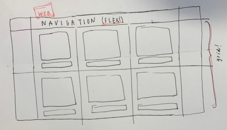
I started with basic sketches that would help guide me. I chose to sketch out where I would use grid or flex elements and the different potential pages and layouts of my site. My sketches were simple, yet helped direct me for the next step.
END RESULT:
After researching, brainstorming, and sketching I was ready to code. Over a matter of two weeks, I created my first ever website using my front end development skills!
KEY ASPECTS: RESPONSIVENESS & ACCESSIBILITY
RESPONSIVE:
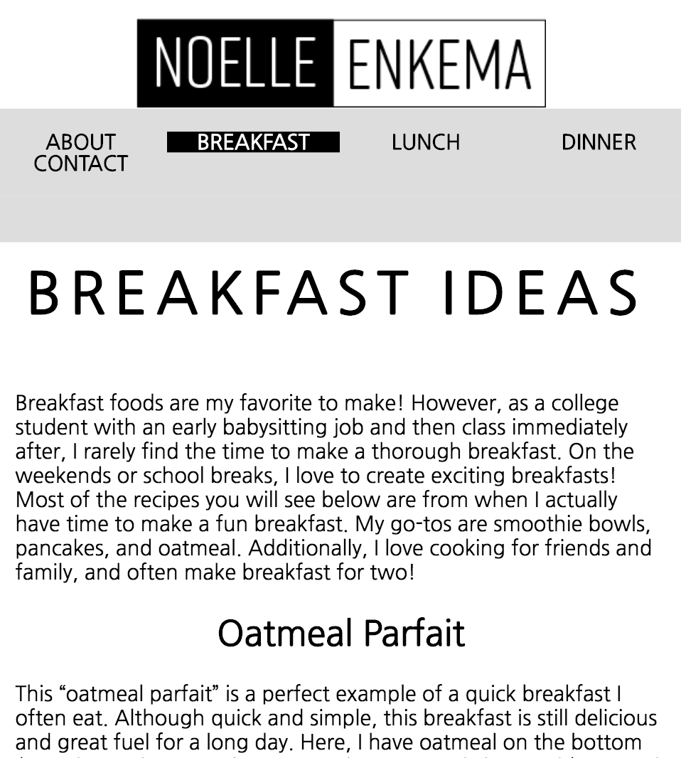
My website works and changes layouts based on whether you are accessing it on a desktop computer, tablet, or phone. In order to make my site responsive, I followed best practices and designed for mobile first. Starting with mobile and then scaling out ensured that when viewing from the smallest screen, the design was efficient and understandable. Check out my mobile view, tablet view, and desktop views below!
ACCESSIBLE:
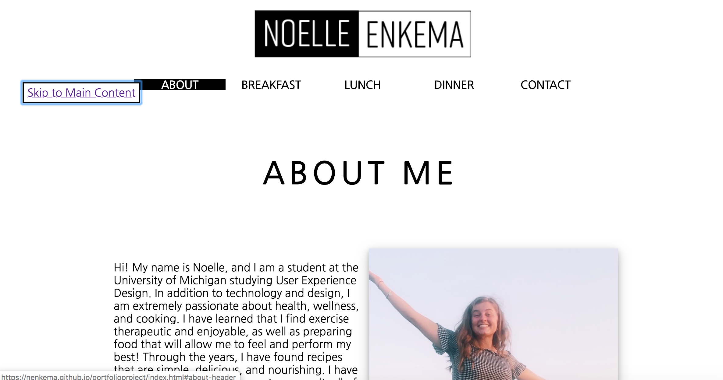
In order to allow any user – regardless of level of ability – to access my website, I ensured that the entire site can be navigated with the “tab” button. This allows those who can’t use a mouse or trackpad to still be able to navigate through my site. Additionally, each image has descriptive alt text, so that a screen reader can properly relay information to a user. Below, you can see the “skip to content” button available on each page, that can be controlled by both the tab button and a mouse click!
REFLECTION & NEXT STEPS:
Two main things I learned from this project were the value of collaboration and of designing mobile-first.
I was working on this project alone, and I sometimes found myself getting stuck after staring at the same content for too long. After a few days of chugging alone, I decided to ask one of my peers for help. The fix was simple, and was something I had completely overlooked. This project showed me that even when looking alone, asking a second set of eyes for help is extremely beneficial.
Second, this project taught me the value of designing mobile first. Although not as intuitive, it was very helpful to begin with a simple, stacked mobile first design. This would allow me to expand my design to bigger screen sizes more seamlessly!
As far as where I see this project going next, I want to continue to add to my website. As my recipe bank grows, I want to continue adding content so that I can refer back to it for inspiration.
I am extremely proud of my personal site, and loved this project!


