GATORADE sec: website design
MOTIVE INTERNSHIP | SUMMER 2020
OVERVIEW:
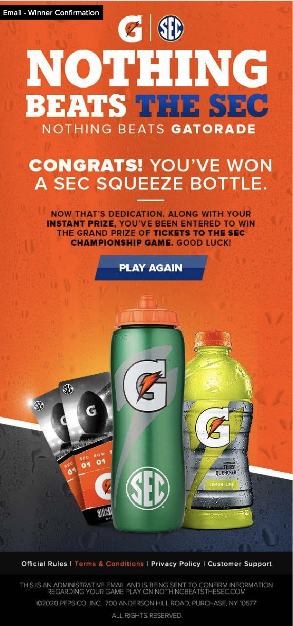
Over the summer of 2020, Motive helped Gatorade SEC to host a contest where participants could win an SEC squeeze bottle and tickets to the SEC Championship Game. Following the principle of mobile first design, a mobile design was first brainstormed, created, and selected by Gatorade. After the final design was selected, I was asked to create a website design that used all of the same design structure and elements of the mobile design, as well as complete the continuation designs for the contest website designs.
GOAL:
Create a captivating website for the SEC Gatorade Contest that embodies the elements and structure of the chosen mobile design.
PROBLEM STATEMENT:
How might we utilize the structure of the mobile design in order to create a responsive, accessible, engaging website?
DESIGN PROCESS:
Understand → Research → Wireframe → Design → Feedback → Refine → Continuation Designs
Understand:
In order to complete this project, I needed to dive into the mobile design and understand the placement and motivation behind all of the page’s elements. I needed to ask myself why certain content and structures were used in order to learn how to best place them on the new design. Additionally, I had to understand the project requirements including size, deadline, and typical design process followed by Gatorade and Motive.
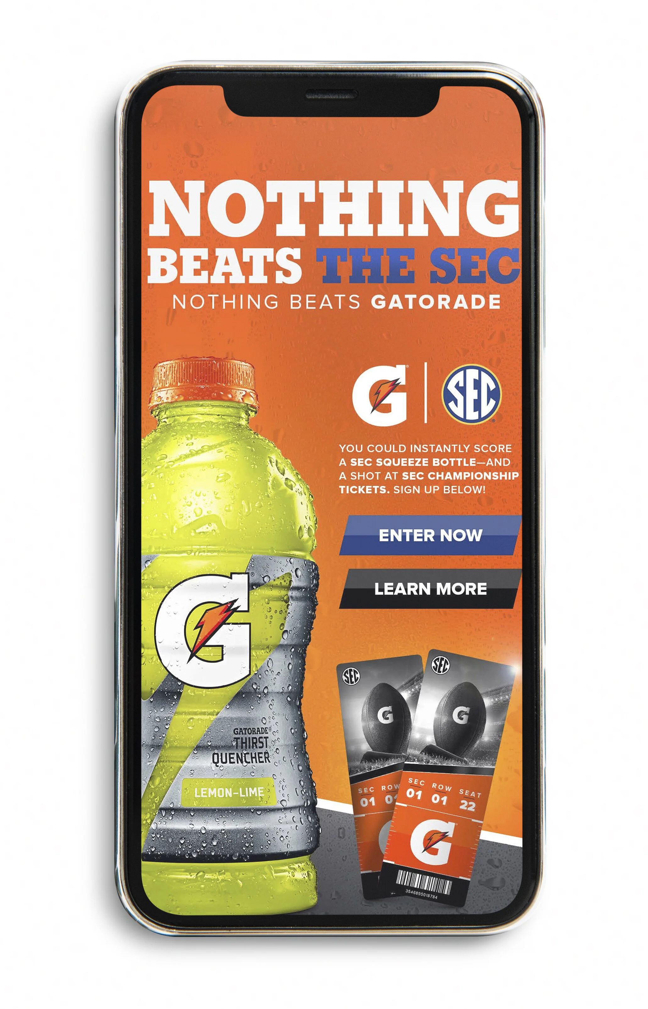
Featured to the left is the mobile design that I used as a reference to create the desktop design:
Research:
For the research portion of this project, I began researching Gatorade’s brand. Although I had previously created a design for Gatorade, I had yet to work with Gatorade SEC. This sector of Gatorade has its own brand guidelines and requirements that I needed to carefully research. Next, I had to research typical mobile to desktop design best practices. Practicing mobile first design is great from an accessibility and efficiency standpoint, and so I had to research and understand the importance of this concept – and how to best take the mobile design to desktop.
WIREFRAME:
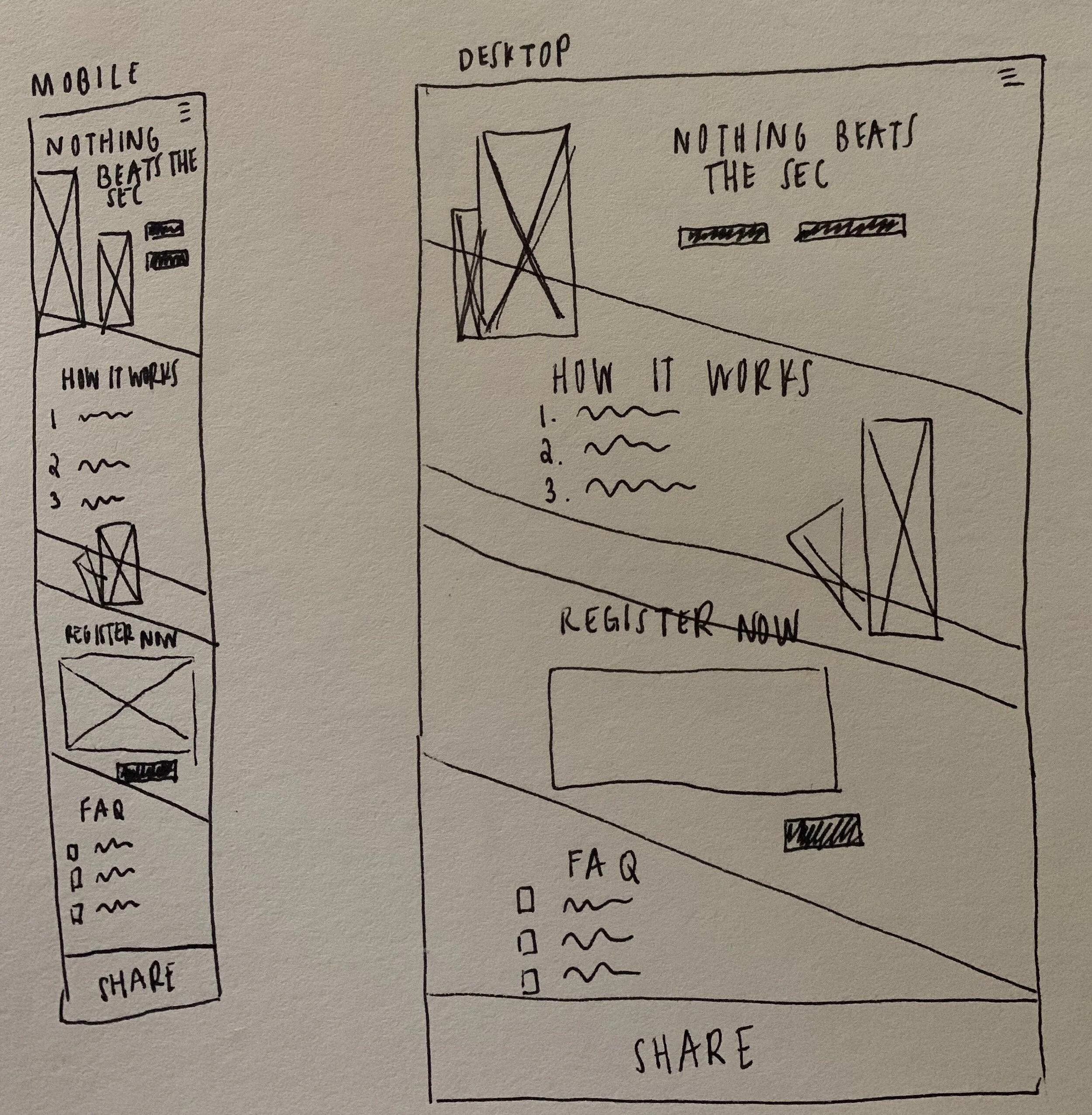
Before moving onto design, I created a wireframe for the mobile design. Simplifying the mobile design into a wireframe allowed me to digest the design and discover the most important page elements.
From there, I was able to play around with the desktop design. Using the mobile wireframe as a base, I was able to experiment with the most effective placement of those elements on desktop. Wireframing was extremely helpful in order for me to understand the placement, hierarchy, and accessibility of different elements. Seeing the mobile and desktop wireframes next to each other helped me to visualize how the design would switch, stretch, and transform when transferred from one device to another.
Starting with mobile and building out desktop allowed us to ensure that the design would be feasible, accessible, and effective on both mobile and desktop.
DESIGN:
After validating this wireframe, I was ready to design!
Ensuring that I was carrying over a similar style, structure, and position was very challenging. At first, I definitely underestimated the challenge of this project. Creating larger elements that matched the same style and function of the mobile design, while maintaining a similar layout and feel was quite difficult. I struggled creating specific elements, such as a larger “registration” page. I executed the project by creating the design in Photoshop, and then testing the design’s final look in Invision. In addition to practicing wire framing, validation, and following brand guidelines, this project allowed me to practice the following skills:
accessibility design
designing for multiple interfaces
cross-functional collaboration through working with developers and project managers
photo manipulation
quality assurance testing
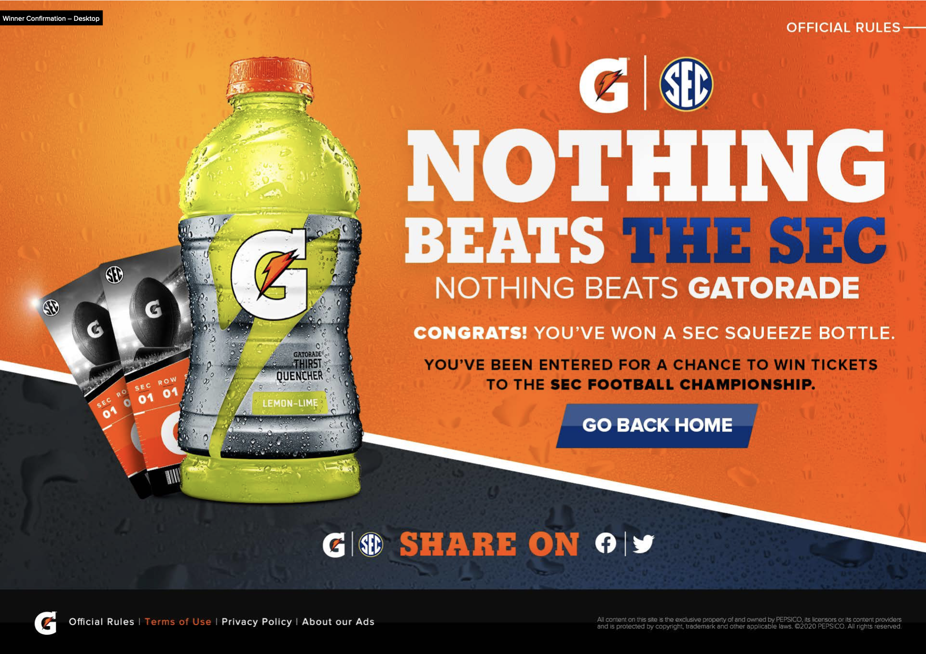
Below is the finished design!
continuation designs:
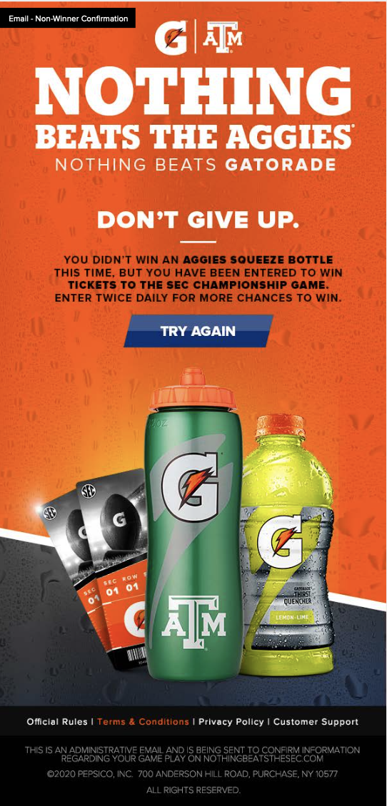
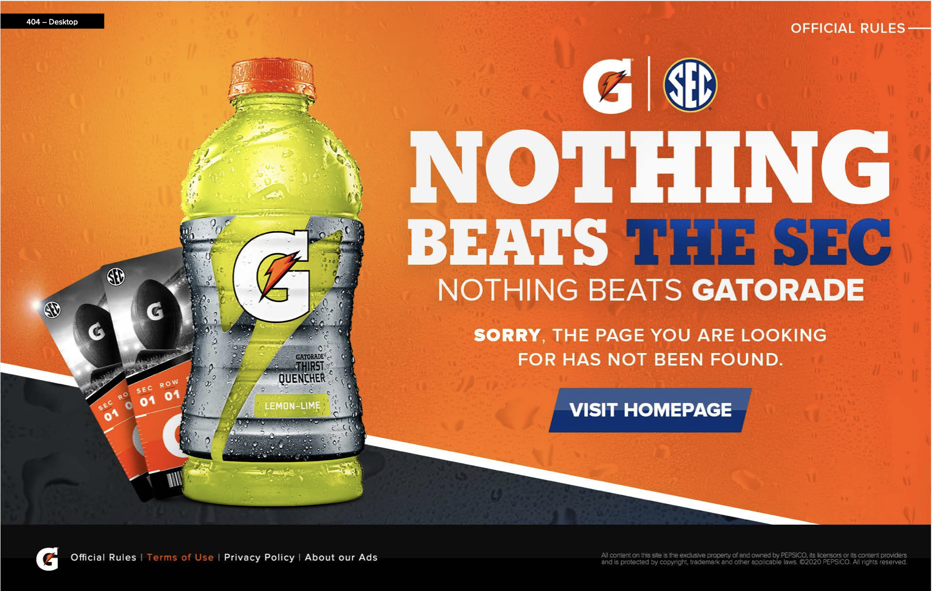
After design was finalized, I created continuation designs for all of the pages. These continuation designs served as high fidelity prototypes for the developing team. Each desktop and mobile page was carefully and deliberately mapped out, in order to make the developer’s lives easier, and increase the success and speed of the project overall. Below are a few examples of the prototypes I made for the contest’s pages.
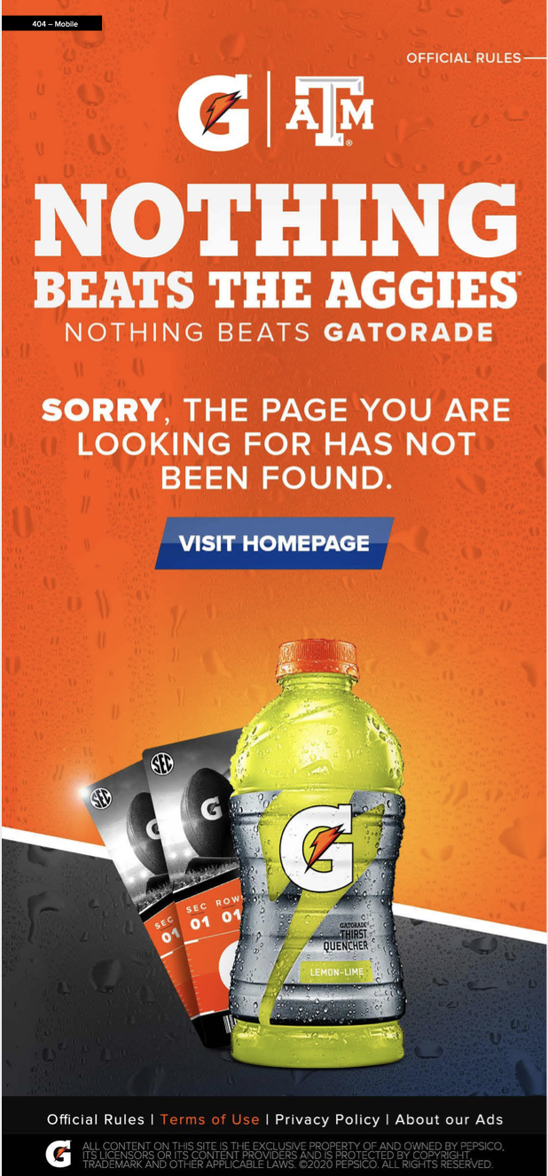
Although the contest has now ended, the “Error Page” that I created is still live!
REFLECTION & NEXT STEPS:
Two main things I learned from this project were the value of wireframes and the importance of mobile first design.
The mobile version of this design was created first. Because the mobile design had a smaller screen to work with, it was critical to ensure that all of the project requirements and page elements would work effectively on the mobile site. Creating a dynamic, engaging, and digestible mobile design and then transferring that to desktop ensured accessibility and effectiveness of this project! Because I was involved in this project every step of the way, I was able to see the impact that mobile first design had on the developing team.
Another major takeaway was the value of wireframes. Using a wireframe of the mobile design to transfer it to desktop allowed me to prioritize the page’s most important features, and make sure that I was focusing on function and form rather than style. Utilizing wireframes allowed me to effectively plan, prioritize, and ensure success when translating the mobile design to desktop!
It was so rewarding and exciting to see my work live on Gatorade’s site!

