NISHIKIGOI BRANDING & UI DESIGN

CLIENT BRANDING AND UI DESIGN | FALL 2019
INDIVIDUAL CLASS PROJECT
OVERVIEW:
Wanting to challenge my graphic design and UI design skills, I created branding and UI guidelines for Nishikigoi: a network for people who are passionate about raising Koi fish.
GOAL:
Create a detailed logo, brand guide, and corresponding UI elements for Nishikigoi.
CONSTRAINTS:
The logo and branding needed to be clean, utilize negative space, and use colors related to Koi fish and water.
DESIGN PROCESS:
Understand → Research → sketch → drafts → get feedback → refine → create branding guidelines → create UI elements
UNDERSTAND THE REQUIREMENTS AND CONSTRAINTS:
Understanding the requirements was crucial to the success of my designs. Knowing that the client wanted negative space and a specific color scheme was key to the design of my project. Additionally, ensuring that the logo was clean, readable, and scalable was also important when researching and designing.
RESEARCH:
After understanding the requirements. I set out to research other logos with negative space. I turned to different search platforms and social media, and looked for logos that incorporated animals and utilized negative space. This step was important to see how others have successfully incorporated similar requirements.
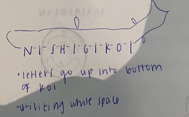
SKETCH:
After researching, I began sketching. With a broad color scheme in mind (reds and blues), I began sketching different ideas that incorporated Koi fish in some manner. I played around with different designs, some which utilized Koi fish more directly than others.


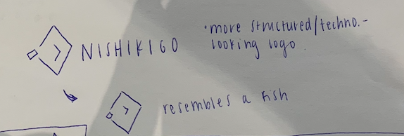
DRAFTS:
After sketching, I began by creating my first vector-ized versions of my sketches. I brought the designs to life that I felt had the most potential for scalability and success with the client. This phase is also where I began to add in and play around with my color scheme.


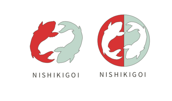


FEEDBACK AND REFINE:

After designing drafts, I got feedback on my logos. I asked peers which design they think was working best, which design had the most potential for scalability, and how they thought the color scheme was working. I used this feedback to create a final design.
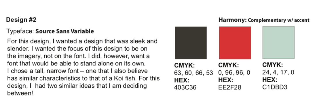
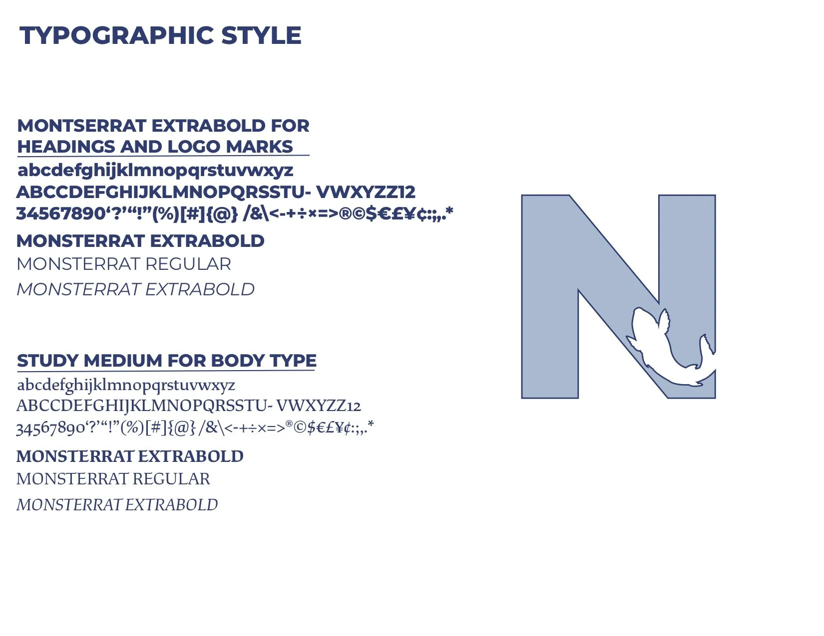
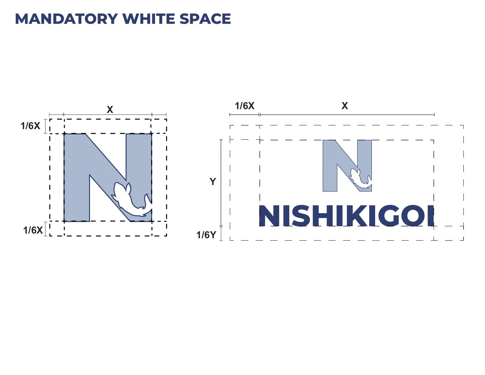
BRAND GUIDELINES:
Next, I created fully-developed brand guidelines. These guidelines demonstrated the appropriate color scheme, typography, different use cases, and potential apparel mock-ups.


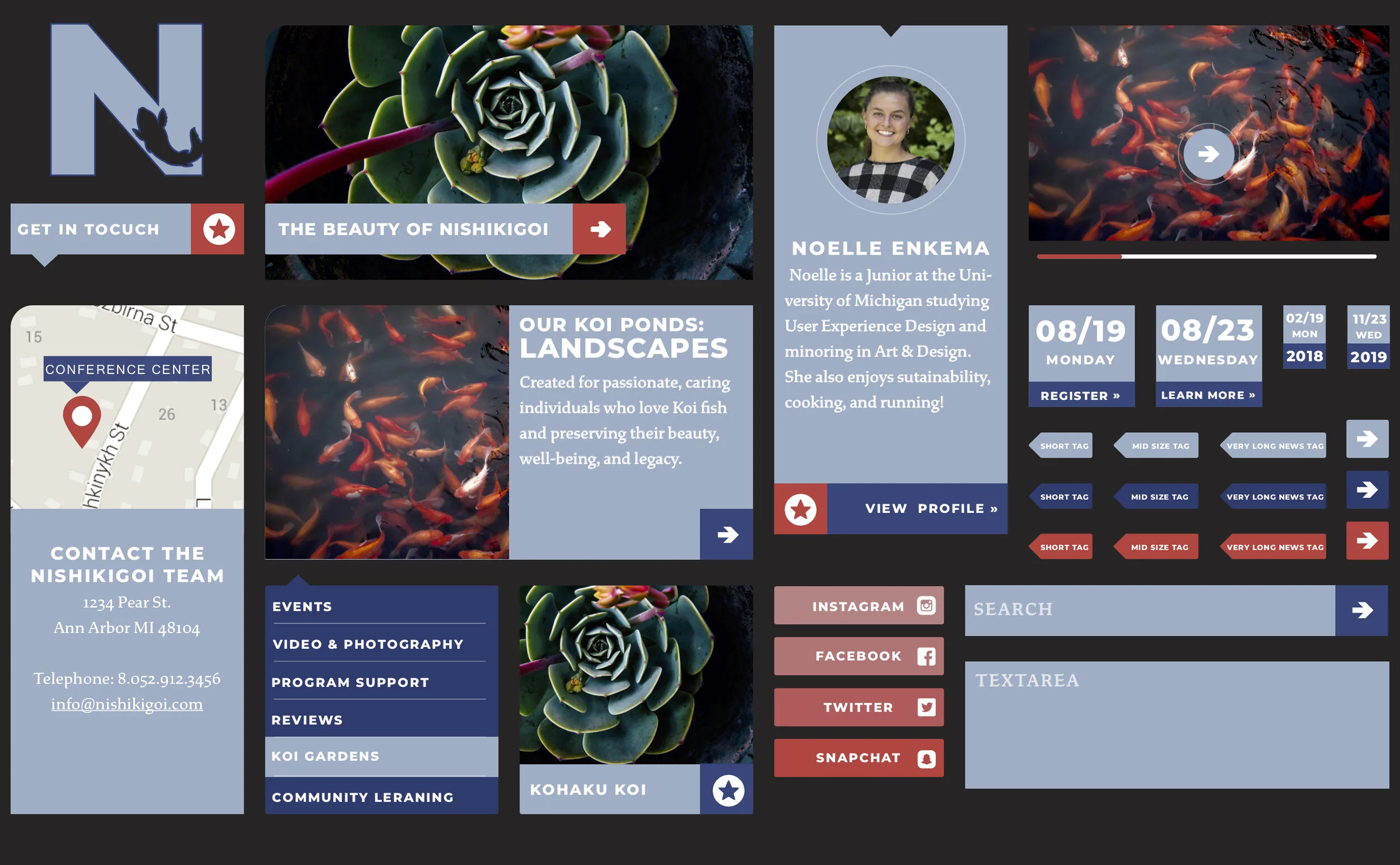
UI ELEMENTS:
Knowing that this design would potentially be used on the client’s social media and website, I created corresponding UI elements to ensure consistency. These elements challenged me to stick to my guidelines, color scheme, and ensure that the idea I had created was suitable for different use cases.
REFLECTION & NEXT STEPS:
This project challenged me to use specific client requirements throughout the entirety of the project. I kept the requirements in mind through every stage of the project, from research to creating UI elements. Because I kept these in mind, I felt that my end designs were successful and representative of the client’s goals.
Next steps for this project are to continue testing the logo and color scheme in different use cases to ensure that it is suitable for different environments.