SPROUT SCHOOL
Interaction Design | FALL 2020
SPROUT SCHOOL: A LEARNING MANAGEMENT SYSTEM TO INSPIRE STUDENTS TO GROW IN A SOCIAL, COMMUNITY-ORIENTED VIRTUAL CLASSROOM
Interface: Desktop
Duration: 8 weeks
Tools: Figma, Adobe Illustrator, Invision, Miro
Sprout School is an interactive learning tool that fosters motivation and student interaction. The COVID-19 pandemic has brought about many changes, including the way students learn and feel a sense of community. Sprout School adapts to the current learning environment and allows students to create a plant avatar, grow alongside their peers, and work together with their classmates to achieve milestones and rewards.
My role: Research, Prototype, Visual Identity, Interaction Design, Usability Testing
THE PROBLEM:
Due to COVID-19, learning has shifted to an almost-completely virtual setting. Among those struggling with this shift is elementary students. Current Learning Management Systems (LMS) have allowed students to continue to receive education, however have failed to meet many of elementary students’ needs. Lack of community, engagement, and motivation plagues the virtual elementary school system.
As a student myself, I know the struggles of virtual learning. As an empathetic person, I knew that elementary students below the age of 13 were feeling these struggles even more.
This led to my initial question of: how might we develop a solution that would empower elementary students to have a rewarding and enjoyable virtual education experience ?
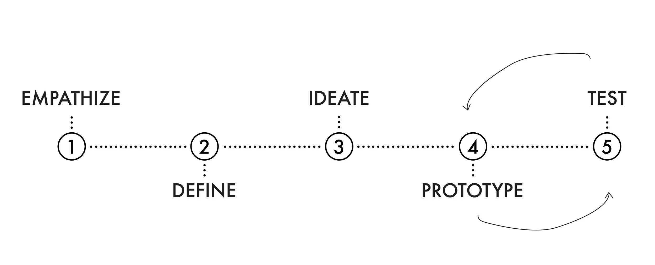
THE process:
EMPATHIZE:
In order to better understand and empathize with elementary students, we completed the following UX research methods: Competitive Analysis, User Interviews and Analysis, Persona Creation, and Scenarios
understanding the space
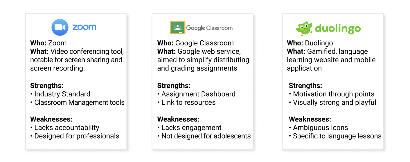
In order to understand current available solutions, we conducted a competitive analysis. This process would allow us to understand successes and failures of current solutions. We started this research with analyzing the following: Zoom, Google Classroom, and Duolingo.
From the competitive analysis we discovered the following 3 main trends in the space, which guided our next step in the process:
Lack of Accountability
Lack of Engagement
Lack of Community
User interviews
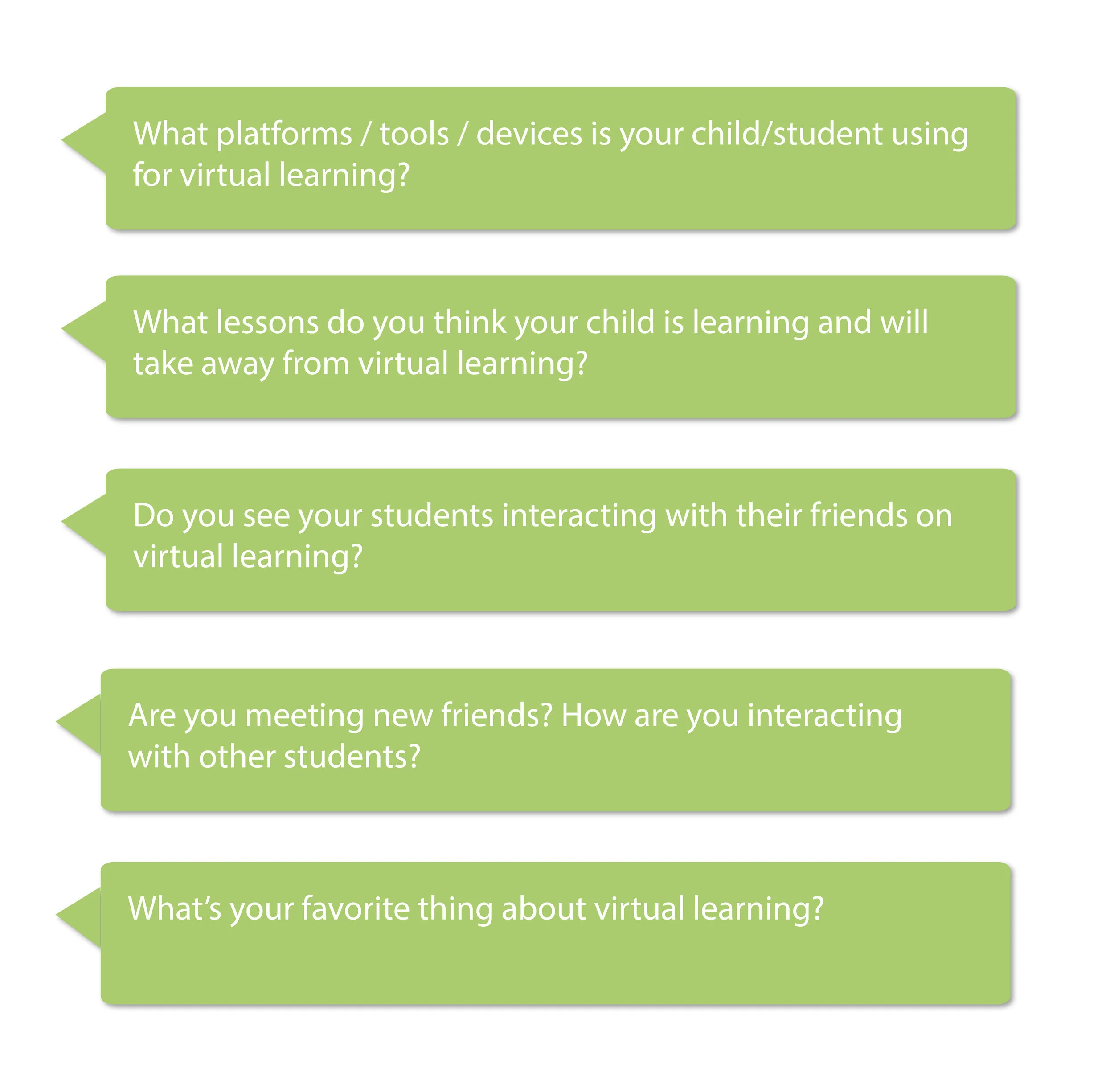
In order to better understand the problem space and user needs, we conducted user interviews with elementary students, parents of elementary students, and elementary school teachers. We interviewed 6 students, 3 parents, and 3 teachers. Through 12 total interviews, our team was able to ensure that our final product would actually satisfy user needs.
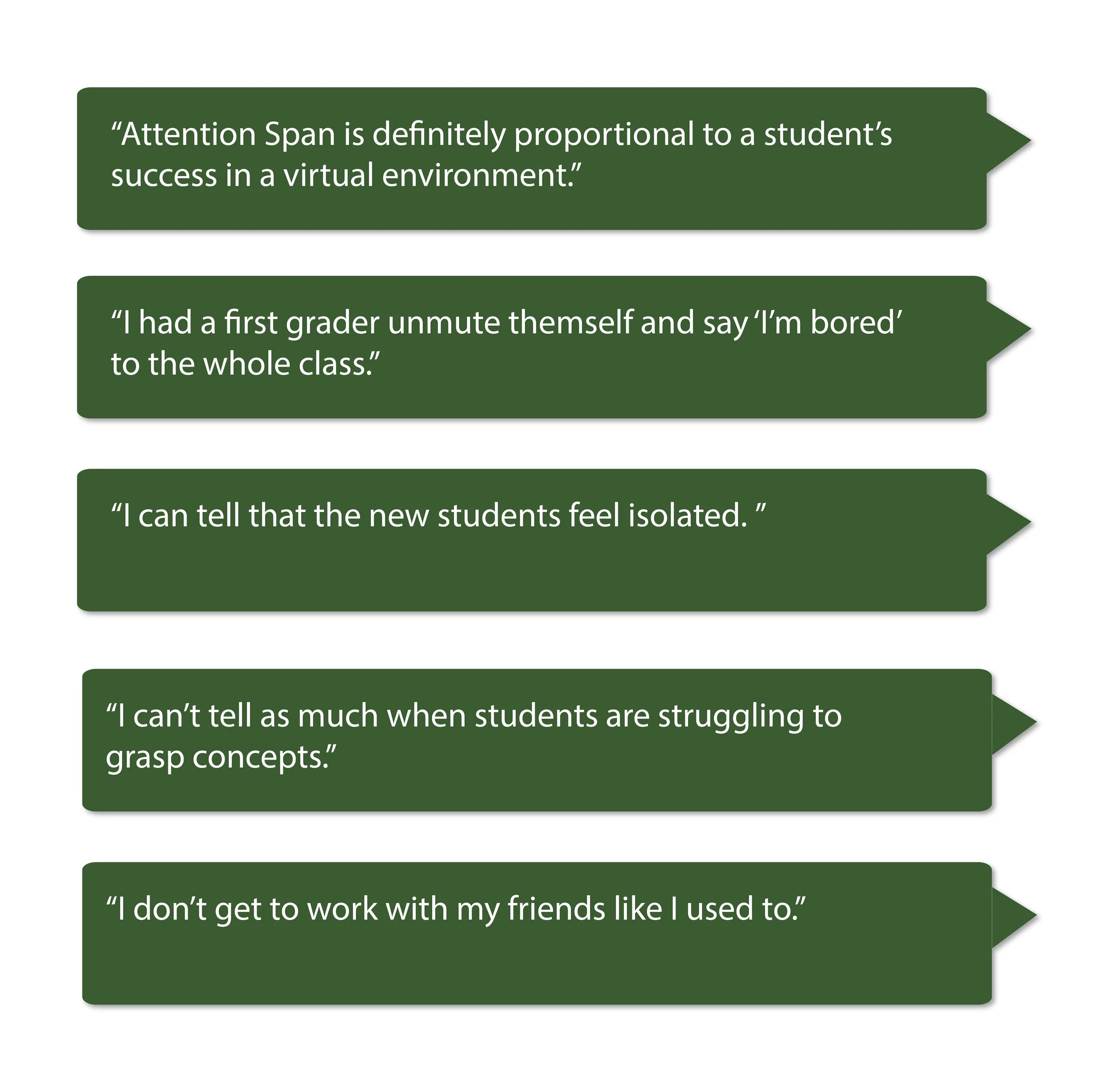
Below are some of the questions asked during the interviews, and relevant quotes that arose:
interview Analysis
Through the user interviews, we discovered the following 4 primary pain points that we would use to inspire our project development:
Minimal Accountability: Young students lack intrinsic accountability and become subject to distractions. They may not understand why they can’t play video games instead of doing homework, especially since there’s no supervision.
Lack of Community: Students struggled to interact with each other, feel supported, and meet new students.
Limited Technical Ability: Students struggle to learn complicated., inaccessible tech tools such as Zoom, which inhibits their ability to engage in class.
Not Enough Encouragement: Students fail to receive encouragement on an intrinsic level and it’s hard for them to perceive their own learning progress.
The competitive analysis and user interviews demonstrated an overlap in various themes, including: lack of accountability and community. This validated our problem and pushed us to continue working towards a transformative solution.
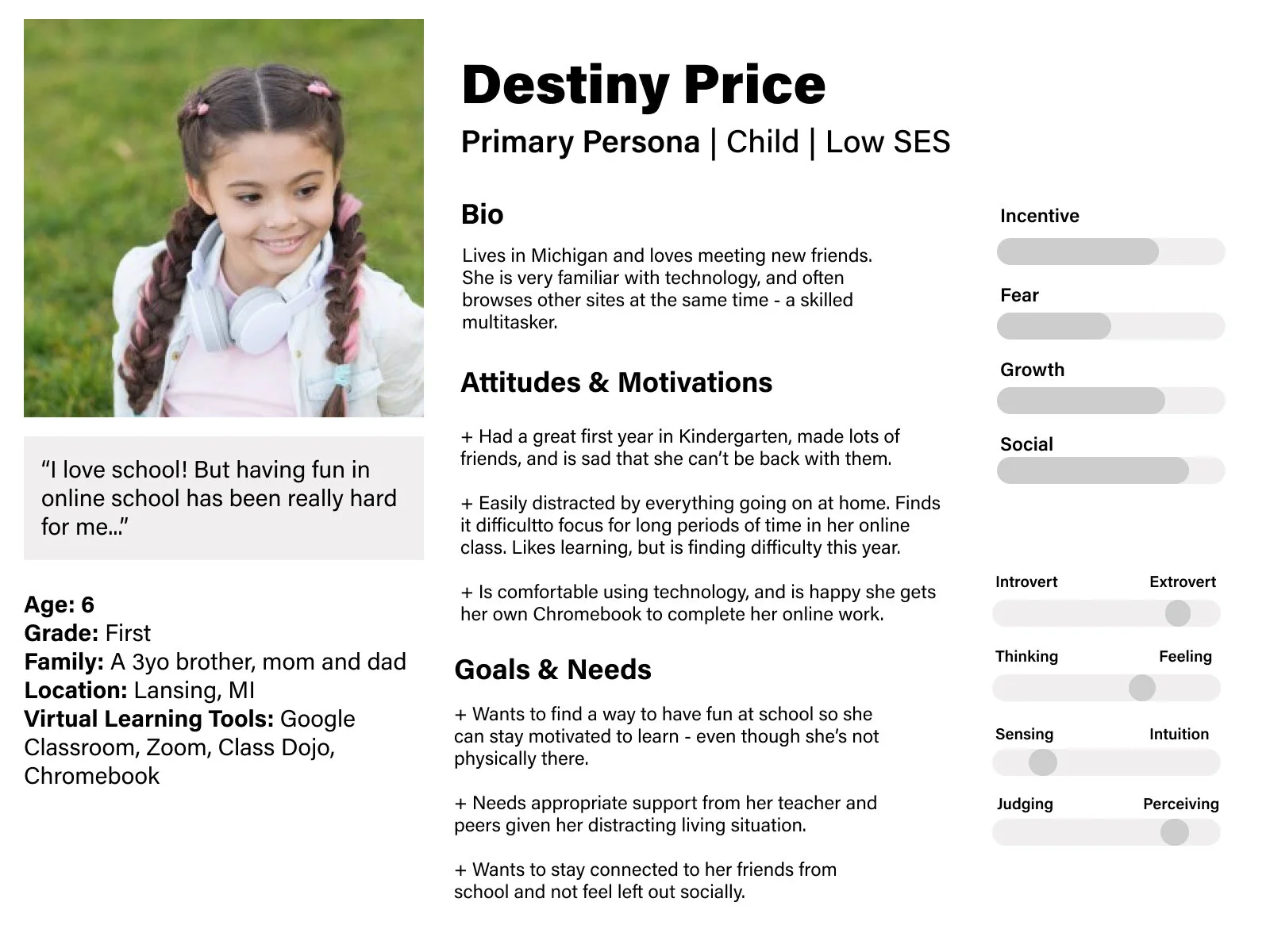
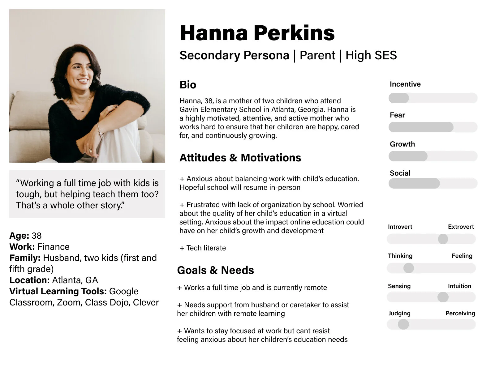
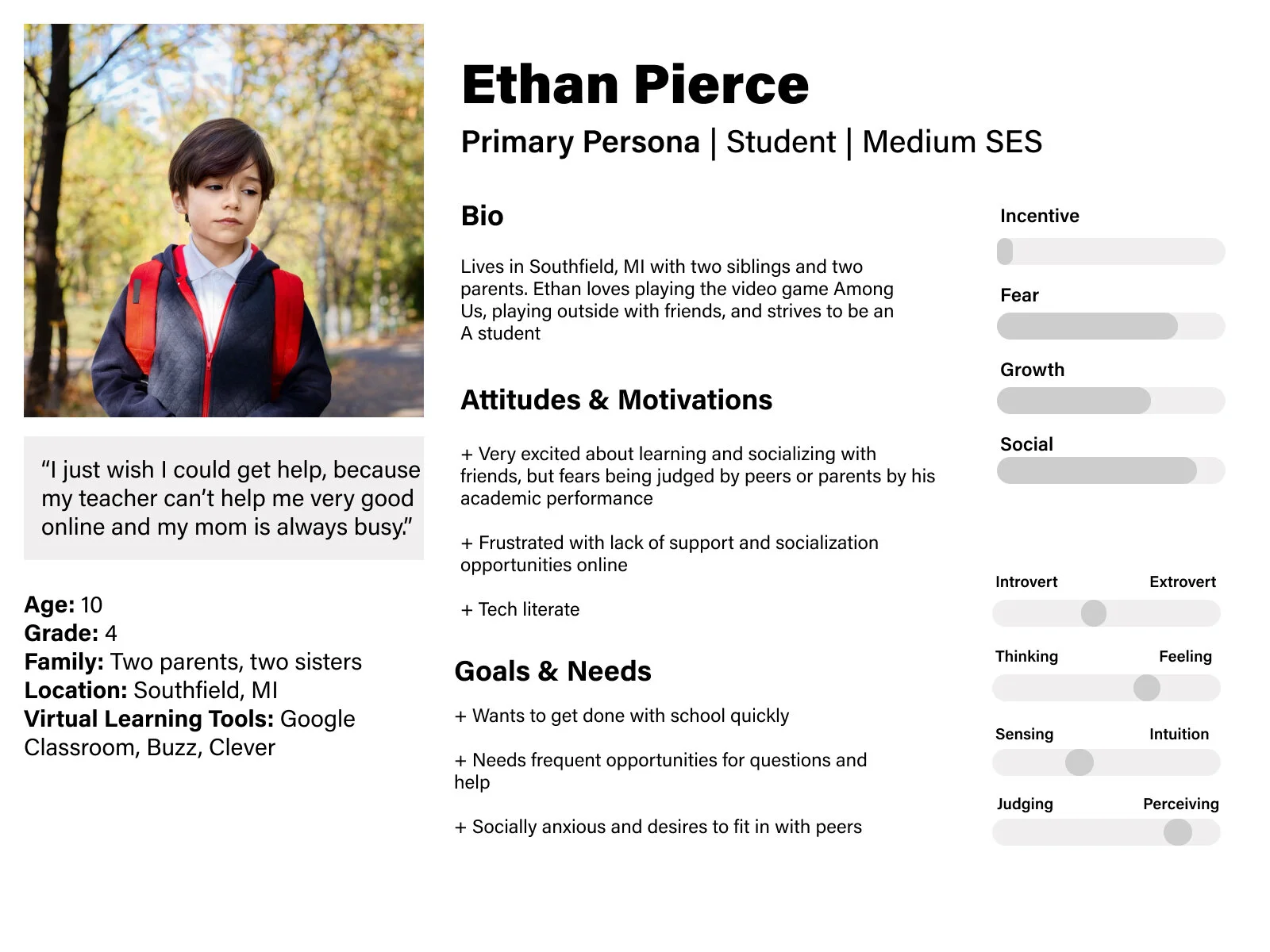
Personas
Guided by the discoveries made in our interview phase, we developed personas in order to feel more connected to our solution. This process required us to be thoughtful, representative, and create empathy and a strong foundation for future project development.
From the personas, we gathered the following insights:
Understanding the user needs of encouragement, motivation, and accountability
Familiarization with user behaviors of distraction, frustration and asking for help
RESEARCH TAKEAWAY:
At this point, our purpose became clear. We needed to develop a way to address elementary students’ pain points, and create an environment that would encourage them to grow as students.
The empathize and research phase was especially important for this project because we were dealing with an unfamiliar target market. Taking the time to understand the struggles of students, teachers, and parents when it came to virtual learning was crucial to the success of our future solution. I really enjoyed taking the time to thoroughly explore, understand, and empathize with a new, unique, and unfamiliar customer segment.
define:
problem statement
COVID-19 exposed the many requirements that the current virtual learning environment fails to fill for young students. While Learning Management Systems like Google Classroom, Schoology, and Canvas couple with video conferencing software like Zoom and Google Meet have been an effective temporary fix, there is a need for a more effective, engaging, and motivating learning tool for young students that will disrupt the virtual and imaginably in person youth learning experience.
Young students (under the age of 13) want to remain engaged and motivated in a virtual classroom setting so they can further their learning, feel supported by their school, and feel connected to their peers.
IDEATE:
We completed the following during the development phase of our project: brainstorm, user flow diagram, paper prototype, usability tests, wireframes.
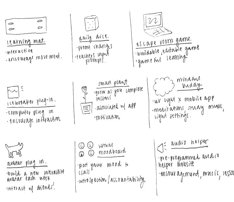
BRAINSTORM
Using the insights gained from the research phase, we held an unmoderated, informal, rapid brainstorm session. During this process we ideated over as many solutions to the problem as we could think of. No idea was out of the question, and we supported each other through iterations of wild, entertaining, and wonderful ideas. This process allowed us to think creatively and openly, and push both ourselves and each other.
Following the brainstorm session, the garden metaphor began to emerge. 🌱 We felt a connection to the idea of growth, and that putting time, effort, and care into something will yield tangible, measurable results. It was at this point that we decided to develop a Learning Management System (LMS) that was interactive, gamified, community-based, and inspired by nature.
user flow diagram
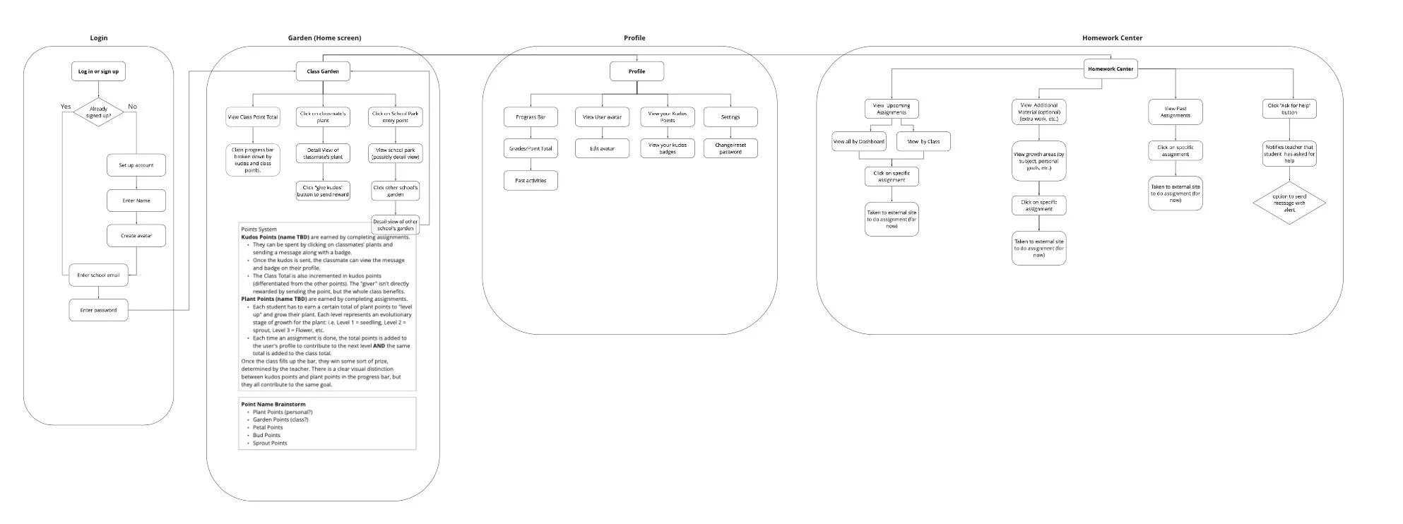
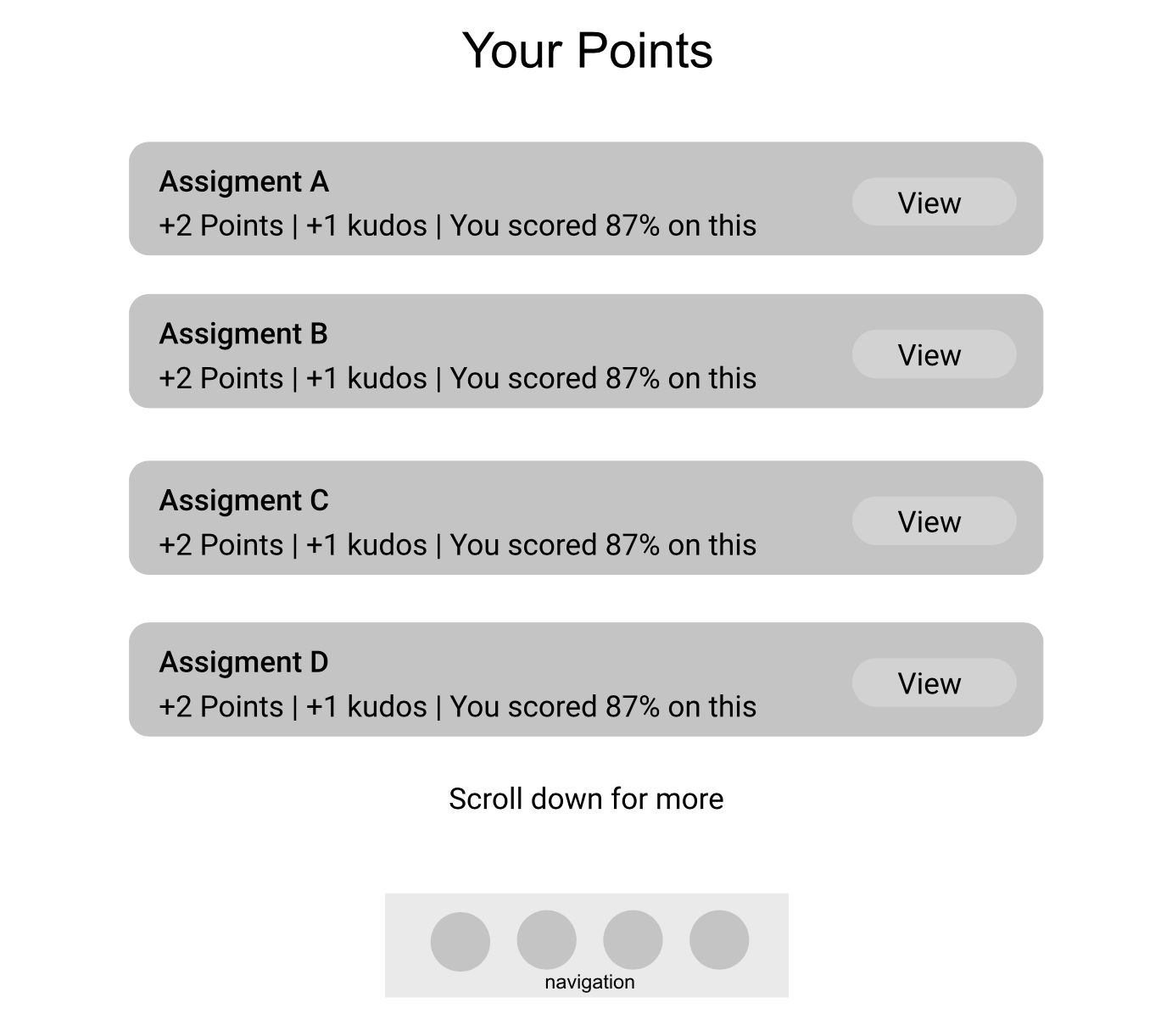
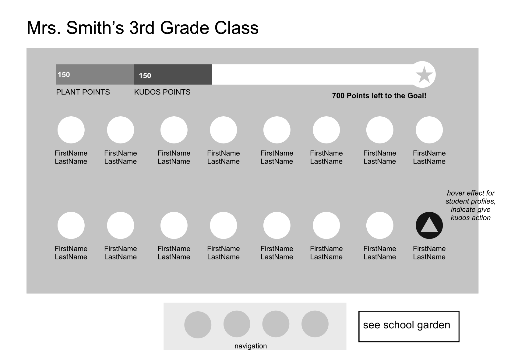
After beginning to move in a direction, we created a user flow diagram to understand user interactions and steps we would need to complete when completing our product development. This began with an information architecture brainstorm exercise, followed by further iteration and refinement. This phase allowed us to solidify the various pages on our interface and potential interactions. We ultimately decided on four main screens: Login, Garden, Profile, Homework Center.
This process really allowed us to think about customer needs, key interactions, and put ourselves into the minds of potential users.
PROTOTYPE:
paper prototype
Next, I created a low-fidelity paper prototype, using the user flow as inspiration. During this phase, I created a physical representation of our idea - incorporating each interaction from the user flow. This process allowed me to use our research to inform decision, and think about the end-to-end experience and bigger picture of our product. Additionally, it allowed me to begin testing design decisions, as I played around with placement, sizing, and representation.
During this phase, the garden metaphor grew.
To view the paper prototype more in depth, check out the walkthrough video, which takes viewers through each step of the prototype.
USABILITY TESTS
Next, I used my paper prototype to conduct a usability test on two users. For the process, I asked my users to complete the following tasks: create an account, view the school garden, check out your class progress, view settings, and view homework assignments.
While the participants were interacting with the paper prototype, I asked them to think aloud. As the user interacted with my prototype, I was able to first hand view pain points and issues they encountered.
I discovered the following pain points through usability testing:
Information Overload when setting up an account
Navigating between the Class and School gardens
Finding the settings page
Point system confusion
Completing this on a low fidelity prototype allowed me to discover problems early on and adjust accordingly, rather than discovering large problems down the line with a high fidelity prototype. Taught me the value of evaluating early, and often.
WIREFRAMES
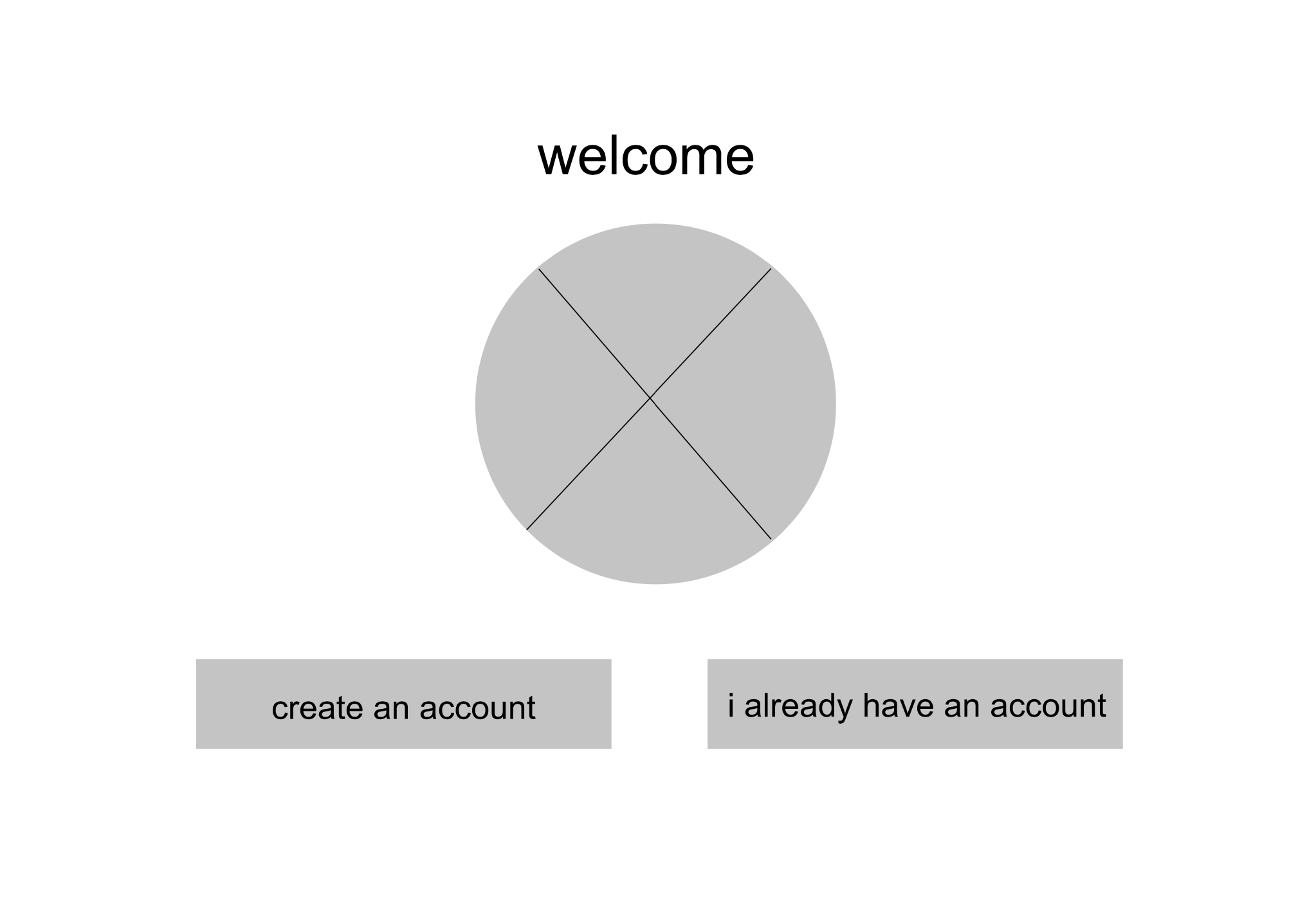
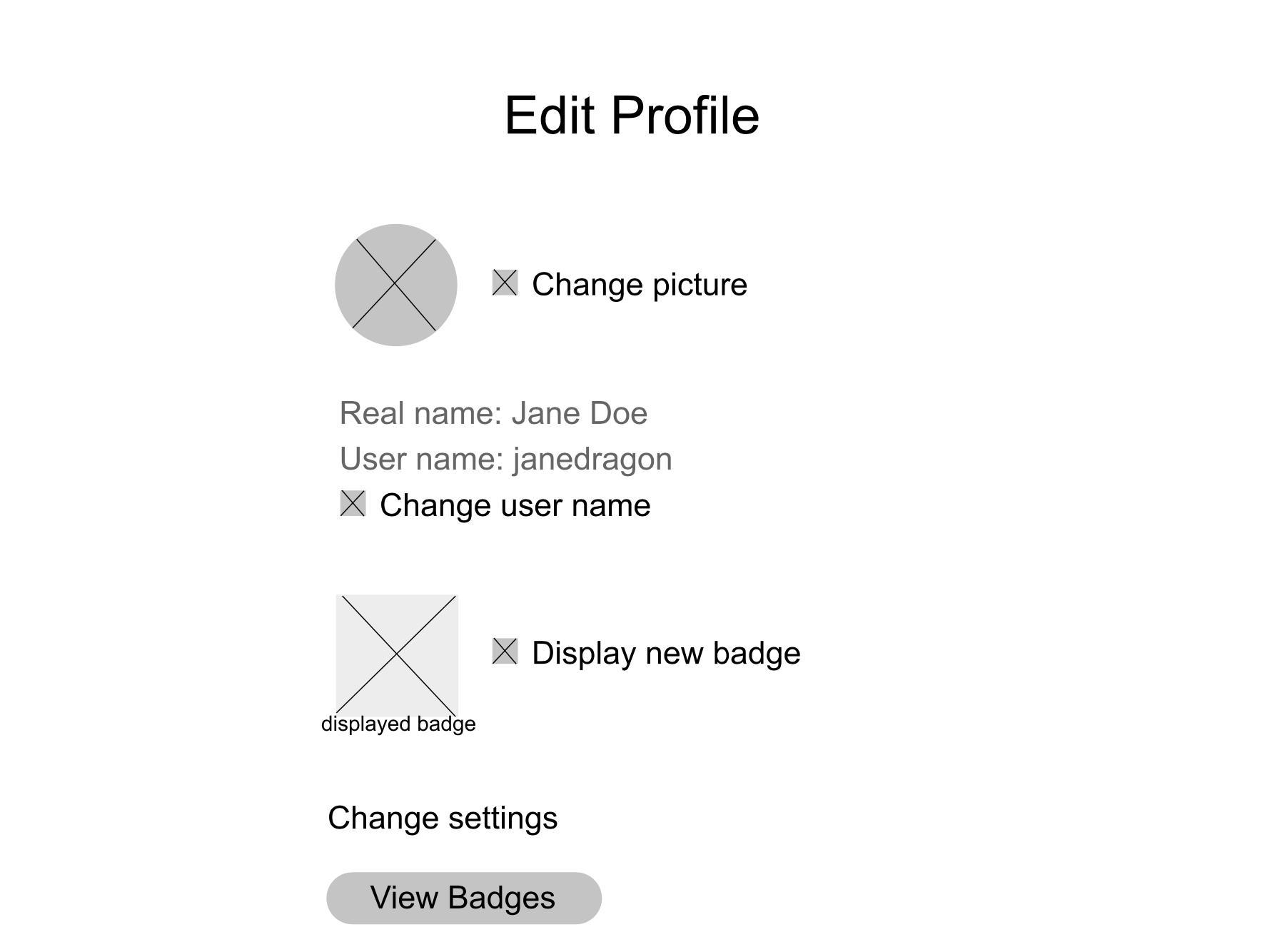
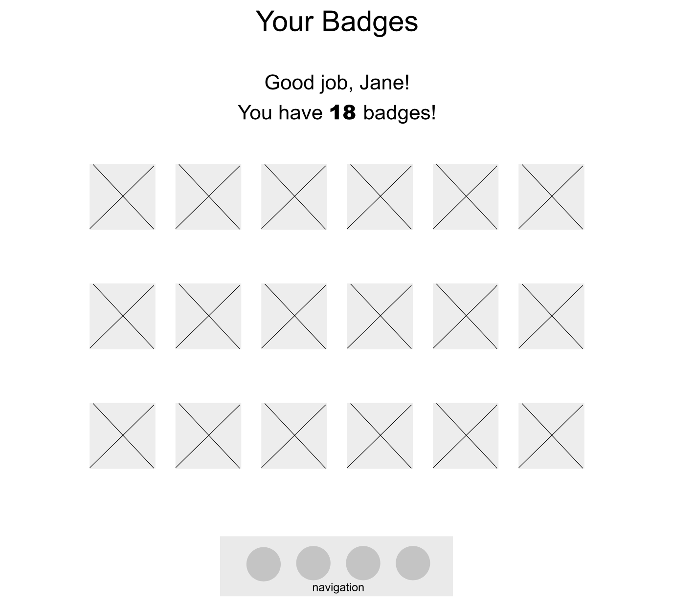
After examining each team members’ paper prototype, usability tests, and insights, we refined and created our first wireframes using Figma. The wireframes were important in allowing us to focus on the structural elements, make clear where we needed to continue ideation, and guide future development.
STYLE
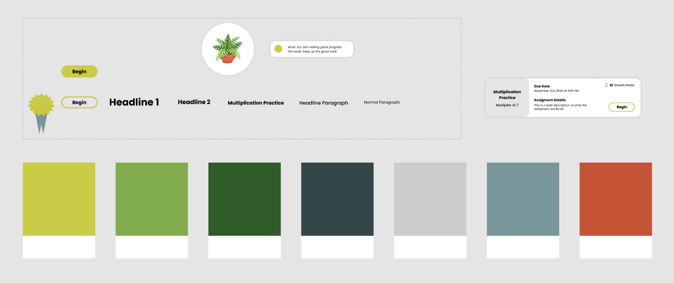
In order to bring our wireframes to life, we had to decide on a clear style moving forward. We established a color guide - including warm, earthy tones – established font, icon style, and CTA style. Deciding on a direction and common style guide allowed us to create cohesive developments.
Our plant metaphor fully came to life here 🌱 , and we also wanted the style of Sprout to include earthy tones, and a playful feel.
avatar creation
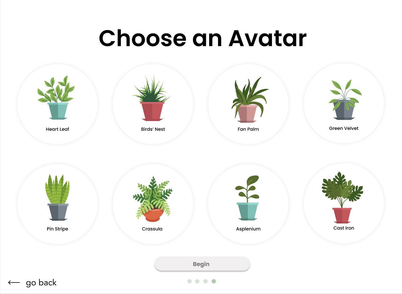
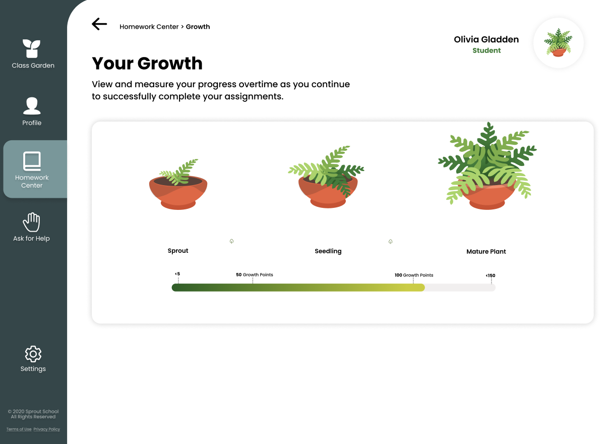
Student progression – represented by avatars – was also crucial to our idea. In order to account for this integral part of our solution, I created avatars to represent students. I created eight different avatars, each with three phases of growth. Creating avatars that students were excited by, drawn to, and would represent their growth clearly was crucial.
logo
We finally decided as a group on a product name: Sprout School. After this milestone, I created a logo to accompany our product and serve as a visual representation of our brand. Ultimately, we. chose a logo that was representative for all of our stakeholders, containing elements that were professional, playful, and informative. Below are various iterations of the logo, and our final design.
early iterations of the logo
final logo
HIGH FIDELITY PROTOTYPE
Taking inspiration from our group moodboard, we created an interactive prototype. This phase of the project was challenging, time consuming, but extremely rewarding. During this phase, we truly saw our idea come to life - and were inspired to continue creating, testing, and refining. Below are frames from our first prototype; check out the video demonstration of our prototype at the bottom of this page to see interactions.
REASONING:
Using our research to inform the structure and design of Sprout School, there were motivations behind our decisions. Below are some key decisions, and the reasoning that went into them:
TEST
Usability testing
Following further refinement, we performed more usability tests on potential users using usertesting.com. During these tests we took notes of pain points, their location on the error face, and their severity. After the tests, we came together as a group, analyzed the results, and discovered overarching issues and themes among users. Through our usability testing, we discovered the following issues:
Inconsistencies with the navigation
Discoverability of key features
Confusion with the point system
At this point, we realized we needed to further explain Sprout’s set up, decrease the learning curve, and increase discoverability.
Final design:
Taking into consideration what we learned from the final usability tests, we refined our prototype. As a result of these tests we completed the following refinements: re-organizing the components of the navigation bar, including clear state indicators of which page a user is on at all times, using pop ups and tool tips, confirming copy, and working out an official point system.
We eventually reached a finished product of which we are so incredibly proud. Check out our live prototype below:
NEXT STEPS & Reflection:
CONSTRAINTS
Lack of experience in the educational space and lack of access to interviewees in target demographic were our main constraint.
NEXT STEPS
Following the creation of our project, our professor reached out to us suggesting application to University of Michigan’s Learning Levers Competition. This competition is “designed to challenge University of Michigan students to invent digital tools with the potential to significantly improve student learning”. As a group, we are working together to refine and potentially submit Sprout School to this competition.
Other features we want to include to Sprout School include:
Development and integration with other learning management tools (ex: Canvas Integration)
Add a Chat Bot for students to get immediate help, increasing the learnability of Sprout School
Develop and execute a lesson occurring on Sprout School
REFLECTION
Sprout School was a challenging project because the target audience (elementary school students) was new to me. Although I was once in elementary school, and frequently babysit, I do not have direct experience being an elementary school student using a virtual learning system. Therefore, research was all the more important during Sprout as understanding the target audience was crucial to Sprout School’s success.
The main skills I practiced during this project were:
conducting, analyzing, and implementing UX Research (especially with adapting to create for a new set of stakeholders)
sharpening my prototyping and interaction design skills
This project was also an example of the iterative nature of design, as we were constantly analyzing, testing, and refining our project. Our main goal was to create a solution that actually addressed user needs. I learned firsthand the value of beginning research early on, and continuing it throughout the project completion.
Overall, Sprout School was an immensely rewarding project. I am going forward as a stronger interaction designer and researcher as a result of my time building Sprout School.

